- Branding
- Design
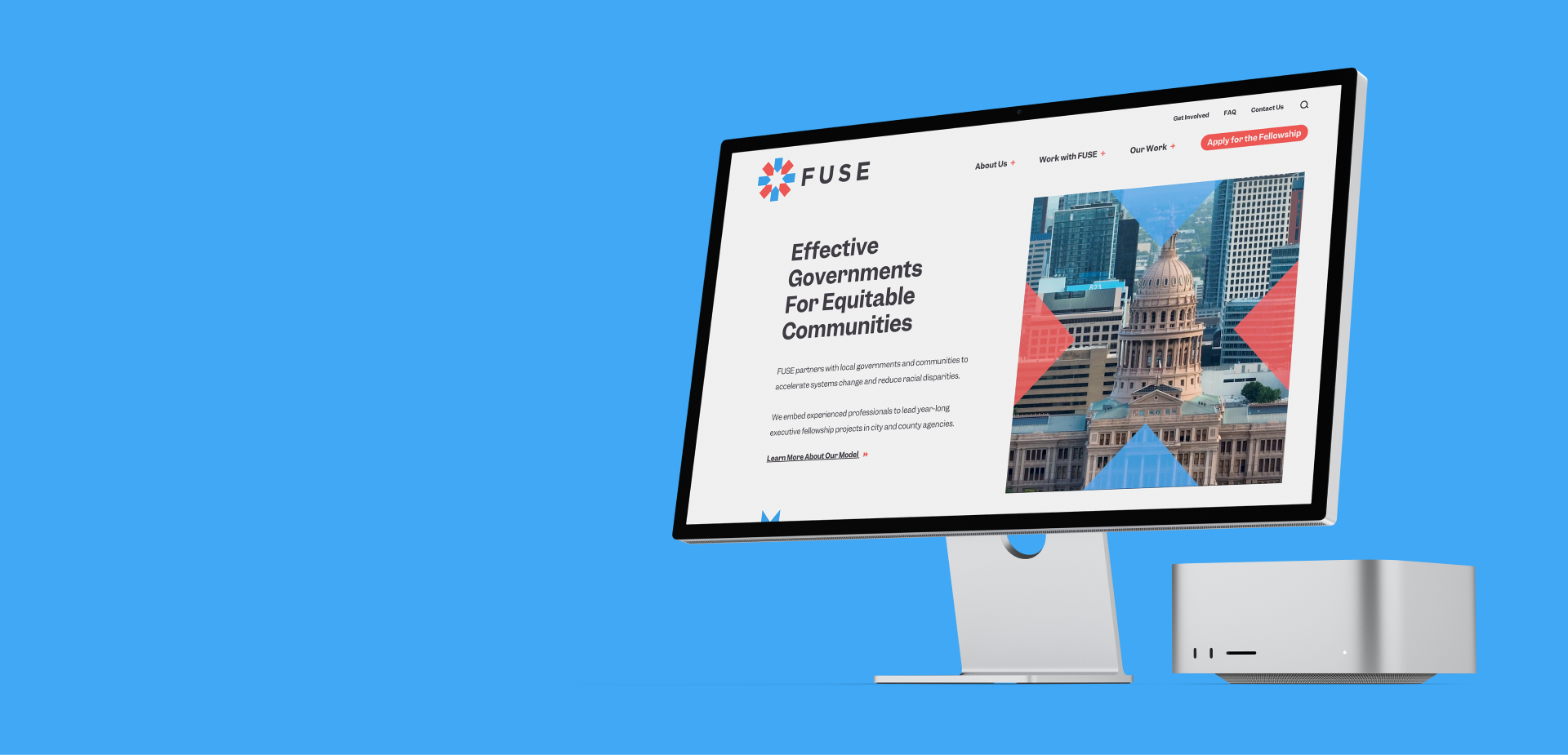
FUSE (formerly FUSE Corps) is a remarkable nonprofit that connects private sector expertise to local governments through an innovative Executive Fellows program. Their model embeds experienced professionals who lead year-long projects in city and county agencies to accelerate systems change and reduce racial disparities.
Because Hiker is equally devoted to elevating the private and public sectors—and because we uphold equity and justice at the apex of our values—we were especially excited to work with FUSE on refreshing their brand and redesigning their website. This meant sorting a complex taxonomy to speak to and appropriately direct a variety of site visitors who included potential and current fellows, community and civic leaders, and also prospective staff and funders. And there was an especially strong need to attract potential government partners by making it clear that FUSE was not an internship program—a common misperception about FUSE.
FUSE appeals to professionals who are driven by ideals but dedicated to practical, tangible change across urgent social and economic issues. Our refresh and redesign had to prioritize social changemaking through a no-nonsense business and government mindset by projecting leadership, positivity, and a serious commitment to an inspirational work ethic.
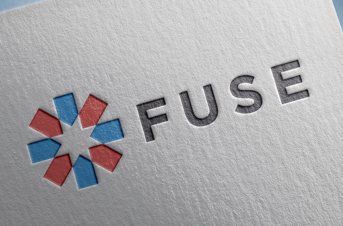
We started by endorsing the removal of the word “Corps” from the organization’s name. This change not only pointed away from “internship” but also made FUSE less about service and more about currents of connection, proximity, ambition, and galvanization of potential.

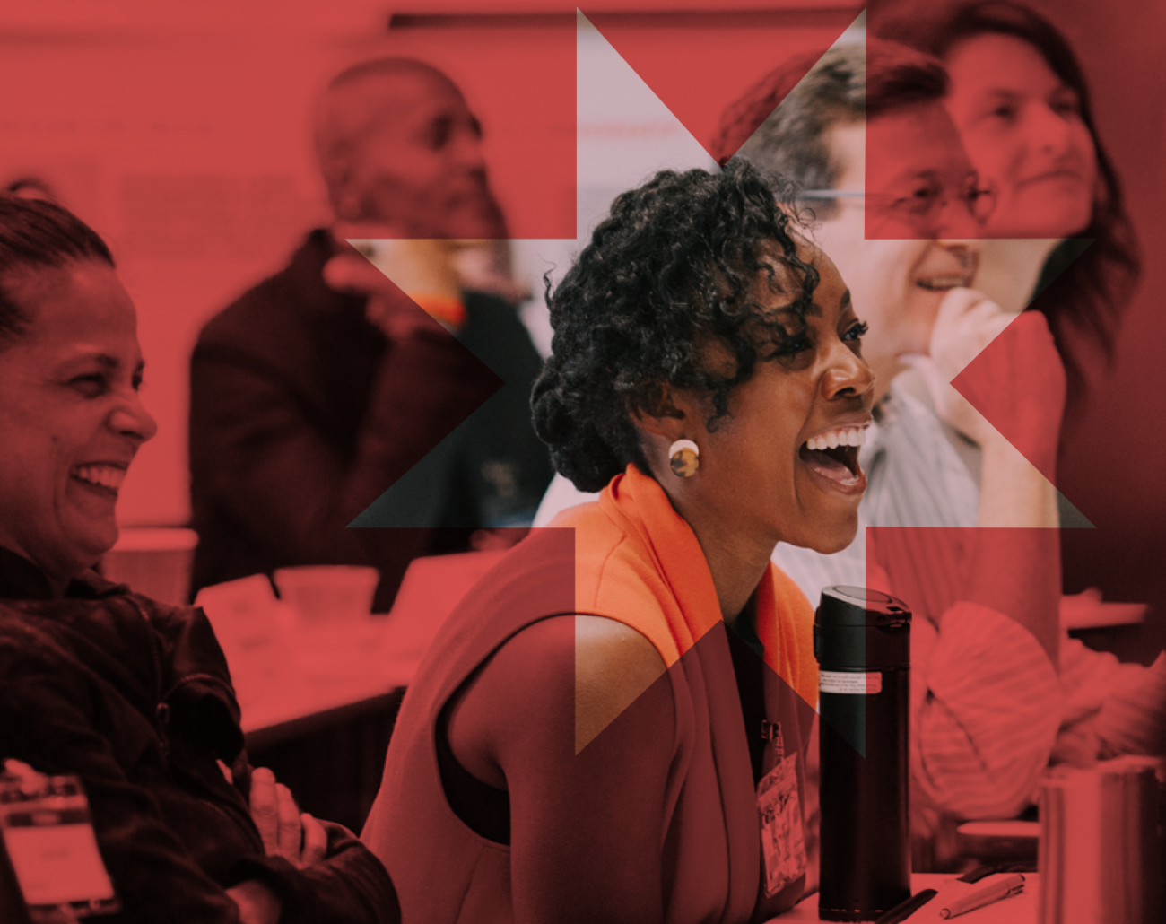
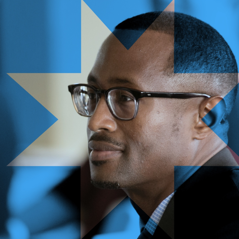
Four “core competencies” are required of FUSE Executive Fellows: Emotional Intelligence, Results Orientation, Perseverance, and Innovation. We used these competencies to guide us in our brand refresh and website redesign. We tapped into Emotional Intelligence by creating a direct, lean but active visual look that leaned into motion as a driver of emotion. We put video imagery of thriving, kinetic cities on the landing page, and set FUSE’s logo icon spinning to create a sense of energy and progress.
To point to a Results Orientation we used simple and bold iconography that pinned FUSE’s projects to urgent issue categories, and we rigorously streamlined FUSE’s tendency toward “policy wonk” language. We evoked Perseverance by getting right to key points and reinforcing those points throughout the site, so that every category of visitor would find intuitive connections to other subpages that “fused” the overall messaging together by making it clear that FUSE’s model was coherent and complete, and self-sustaining.
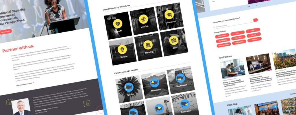
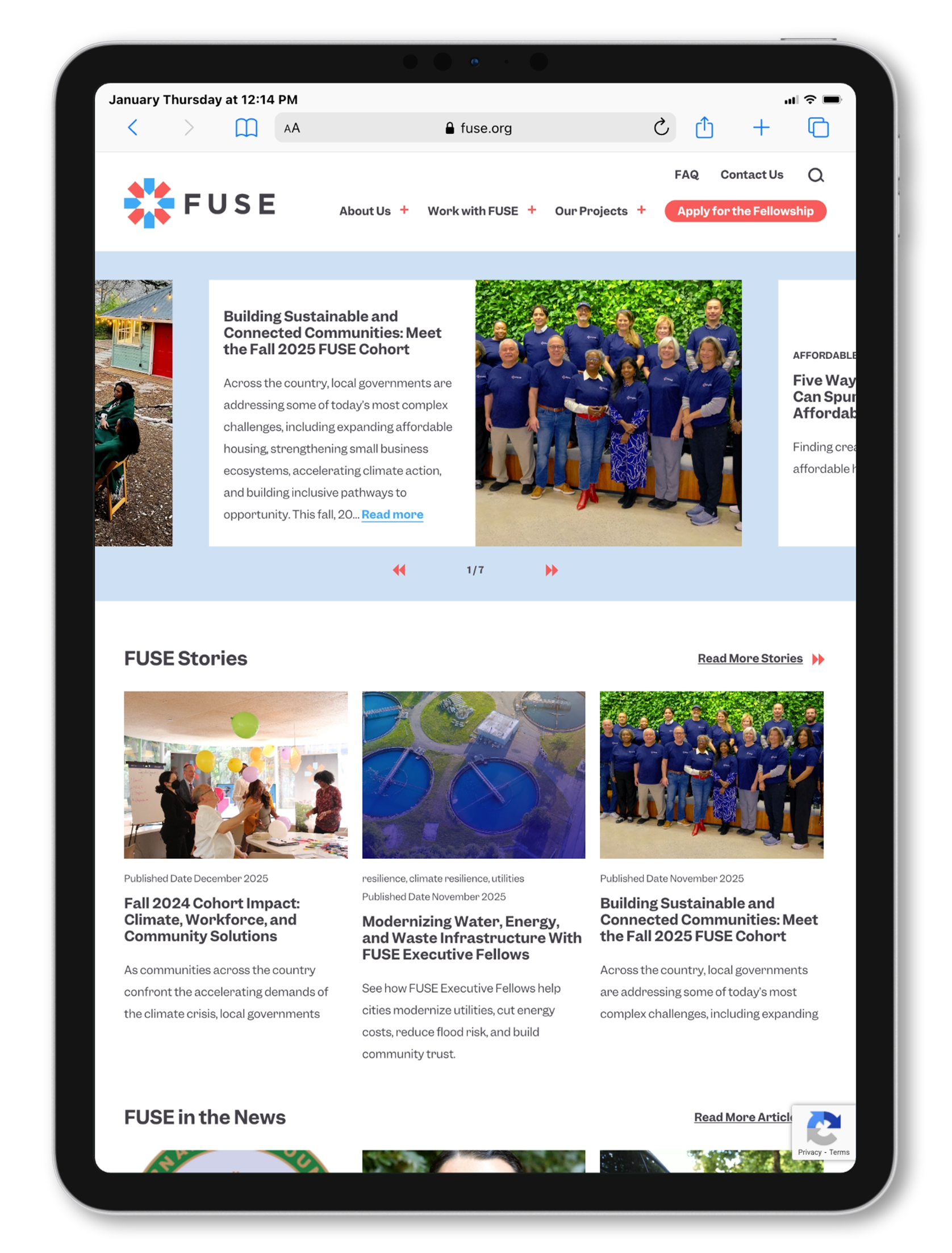
We messaged Innovation by foregrounding a robust newsroom rich with a library of stories about FUSE’s groundbreaking and scalable local successes. This was not only to build proof points for external audiences about the success of the FUSE model but also to ensure that FUSE staff could readily use that library in their marketing efforts. Storytelling, as always, was key—and a prominent newsroom and library made sure of that.